Pipeline Manager is Antmicro’s visual system diagramming tool designed to represent complex data flows as block diagrams, which proves highly effective when developing complex SoC designs, building new hardware, visualizing runtimes for AI/ML models, or depicting optimization flows for modular systems.
Due to its application-agnostic nature, Pipeline Manager can be easily integrated with various systems and formats, making it possible to load, represent, and modify almost any flow-like data either as an embedded HTML frame or as a regular web application that would use a third-party app as a backend. Thanks to communication based on JSON RPC, the implementation of communication between any application and Pipeline Manager is pretty straightforward, which was demonstrated in one of our past blog notes.
At Antmicro we use Pipeline Manager to design AI workflows and optimization pipelines for our open source Kenning platform, build interactive hardware and software design graphs on the System Designer portal, and visualize System-on-Chip designs created with our open source framework for digital design aggregation called Topwrap. In fact, it’s the growing Topwrap use cases that often initiate multiple improvements to Pipeline Manager’s functionality, bringing more features and convenience to both tools.
In this article, we describe the updates introduced to Pipeline Manager since our last article, such as new styling options, custom shapes support, visual grouping of nodes, and better performance for large graphs. These updates enable a more versatile use of Pipeline Manager in contexts that require representing complex systems in the form of modular block diagrams.
Custom shaped nodes and CSS styling features
An improvement that was introduced to achieve more versatility when designing System-on-Chips is the ability to use custom node shapes in graphs. The rendered nodes can be of any shape and are derived from SVG images added as links or file paths to the JSON specification file. Their width and height can also be modified, which allows visualizing multiple nodes of the same shape but in different sizes.
The diagram below features a data flow with custom shape nodes:
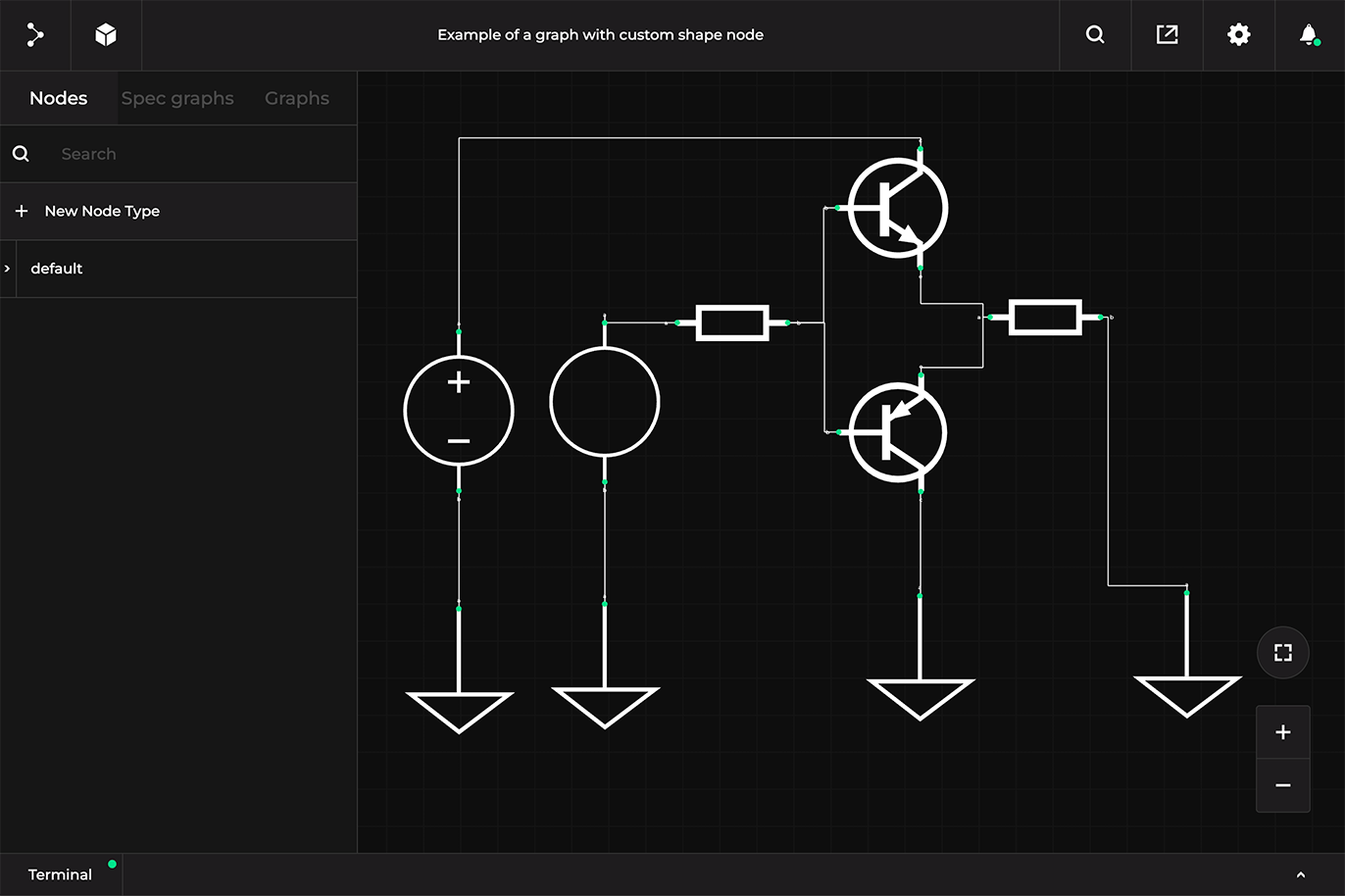 Visit the desktop site to make use of this interactive sandbox.
 You can also explore the interactive version of the diagram in the documentation.
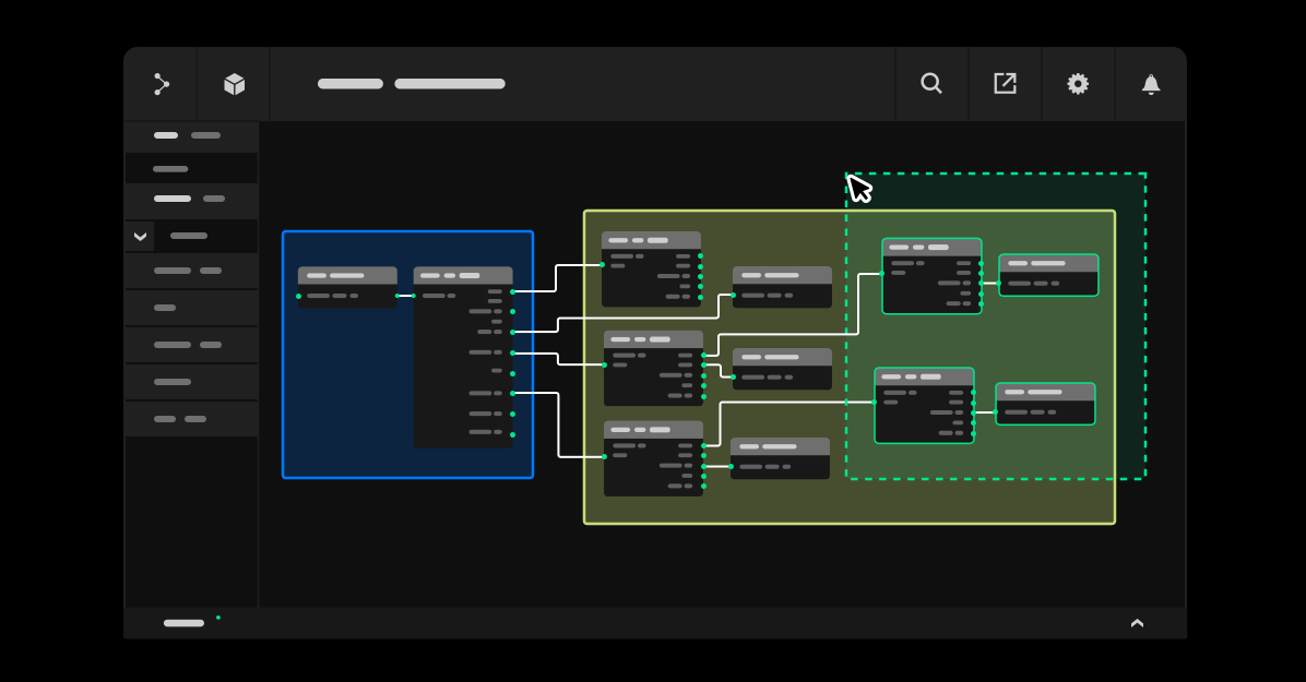
To further improve visual representation of data in Pipeline Manager, we have introduced custom CSS styling for nodes that allows adjusting the visual aspects of complex structures and improving their clarity.
[...]
    "metadata": {
        [...]
        "styles":{
            "AntmicroStyle": {
                "shape": "https://raw.githubusercontent.com/antmicro/antmicro-sphinx-utils/main/logo/white.svg"
            },
            "GNDStyle":{
                "shape": "svgs/gnd.svg",
                "positions": {
                    "a": {
                        "x": 49,
                        "y": 0
                    }
                }
            },
[...]
It is possible to customize the whole node or just its specific parts like title or content. Check how to customize nodes via CSS in the documentation.
New “BUS” interfaces for connecting many nodes in a readable way
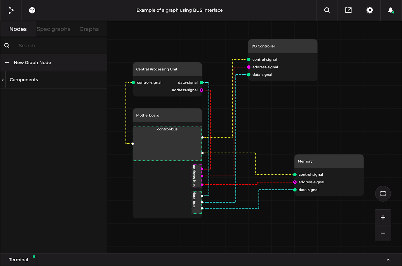
In some graphs, especially from the field of hardware, digital design, and system diagrams, you may need to visualize either a bus to which all peripheral nodes are connected, or a star-like graph where large numbers of nodes are connected to a single interface. To achieve this, we have introduced a new interface type called “BUS”, which is a rectangular interface with configurable height and span to both sides of the node.
The new interface can accept connections on both sides anywhere alongside it, and all connection points can be easily dragged to other positions on the connection area. A single graph can have multiple BUS interfaces and their sizes can be adjusted to user-specified dimensions.
The graph below shows a diagram with the new BUS interface. You can move the nodes and add new ones by dragging and dropping them onto the canvas:
 Visit the desktop site to make use of this interactive sandbox.
 You can learn more about the introduced BUS interface in the documentation.
Multiple graph views
When working on a certain design or flow, you may want to take a look at it with different levels of detail, e.g. display only the main nodes without every single available interface, or have an in-depth view of all types of connections made between devices. You may also want to adjust the layout of the nodes to focus on specific parts of the design, and more.
While you could create new diagrams for each “view”, all of them would be based on the exact same data. To address this, we introduced the possibility to define multiple graph views - they allow you to pick a graph that is defined once, and then provide alternative layouts and styles. Thanks to this improvement, you can have a single graph defined, and then create views for e.g. a minimal high-level overview for documentation, full graph for a complex design, and a graph focused on depicting the flow of data.
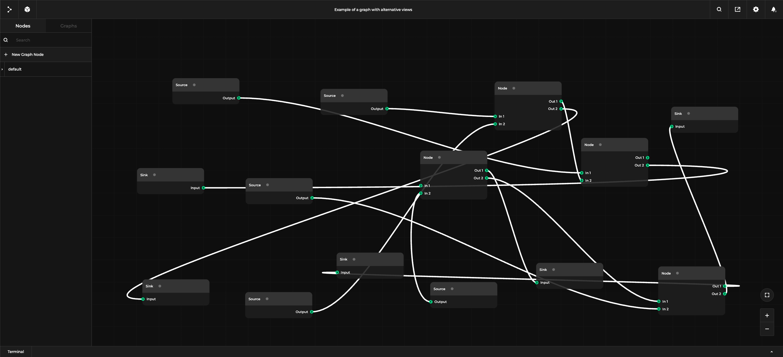 Visit the desktop site to make use of this interactive sandbox.
 To open different views in the graph above, click on Show settings (cog icon) and switch the default view to any other available.
Apart from the above-mentioned update, we have also further simplified the auto-layout mechanism so that it automatically switches interfaces based on the proximity of the connected nodes.
Visual grouping of nodes
Subgraphs were initially introduced to simplify node organization in large designs and better represent multi-layered structures. We further improved this functionality by adding nested subgraphs and node-like styling options. However, as subgraphs are separated from the rest of the graph, it might reduce the transparency of the whole system since the lower-level graph structure is not visible unless you click on the node and open it to inspect what it entails.
As an alternative way to represent subgraphs in data flows, we have added visual groupings of nodes that serve the same role of separating nodes (purely visually) but still ensure full transparency of the whole system:
For more information on how to create and customize node groups, refer to the documentation.
User-filtered node lists in the sidebar
In complex multi-node data flows, locating the node to build or modify a graph can be quite time-consuming. To address this limitation, we have introduced the ability to add new sidebar tabs that contain user-filtered lists of nodes (nodeLists), which are based on custom jq selectors defined in the JSON specification or graph files. This allows querying and displaying nodes and graphs present in the canvas based on any of their properties, interfaces, and more, e.g. all devices with an interface type of i2c.
Thanks to Pipeline Manager’s flexibility, nodes can be filtered based on any of their attributes. The example below defines the whole section of video-only related nodes, which is achieved by grepping their names:
  nodeLists: {
    "All nodes": ".",
    "Video Nodes": "[.[] | select(.name? | contains(\"Video\"))]"
  }
The image below shows the same Video Nodes list displayed in the Pipeline Manager UI:
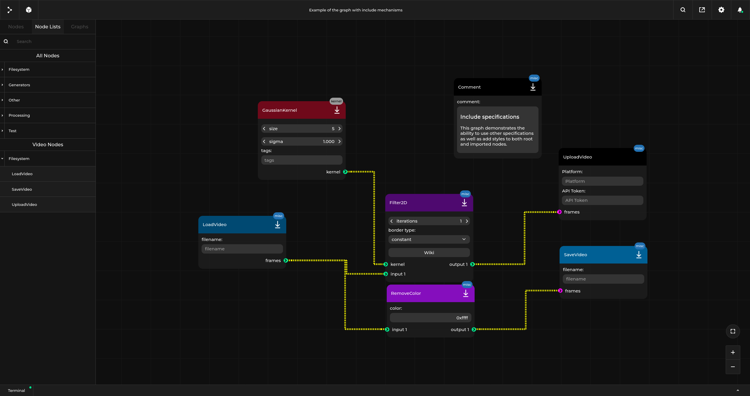
You can also achieve the same filtering of video nodes in the JSON specification by selecting node interfaces or properties.
General performance improvements for visualizing large graphs
Aiming to improve user experience and add support for more complex system representation, we have optimized the performance of Pipeline Manager when loading big graphs.
To broadly illustrate performance gains, we have measured how much time it took to load the Caliptra Root of Trust block with 14462 total nodes and 16344 total connections before and after performance optimizations.
While originally running such a large graph would be time-consuming and far from practical (taking over an hour to render), it currently went down to ~1 minute after numerous improvements in the rendering logic. What is more, movement around such a large graph got heavily improved, allowing smooth usage even for very large designs.
Use Antmicro’s Pipeline Manager for comprehensive visualization of your systems and workflows
We have introduced a broad range of UI, functional, and performance improvements to Pipeline Manager that let you visualize complex information in more versatile and streamlined ways.
Pipeline Manager can be easily integrated into any application that handles graph-like structures, allowing you to depict, edit, and run graphs for a variety of scenarios that span from digital design aggregation to representing AI-assisted flows and any hardware systems, such as boards, industry-specific setups for space or automotive, and more.
It also speeds up cross-team collaboration and the general hardware development process, providing a visualized source-of-truth for multiple teams.
If you would like to use Pipeline Manager for designing complex systems and integrate it into your workflows and tools, contact us via contact@antmicro.com.